Color contrasting floors can drastically boost visibility and safety in your spaces. By choosing high-contrast colors, you'll create clear boundaries that guide movement and reduce confusion. This visual clarity not only helps those with visual impairments but also enhances navigation for everyone. Imagine walking into a brightly colored retail space, where pathways are distinct, making your shopping experience smoother and safer. In homes, contrasting hues can define areas, minimizing trip hazards. Plus, the right colors can evoke emotions, promoting comfort and security. If you explore further, you'll uncover additional insights into effective color choices and their impact.
Importance of Color Contrast
Color contrast plays a crucial role in creating an inviting and functional space. When you choose contrasting colors for your floors, you're not just making a design statement; you're enhancing safety through improved visual perception. Think about how a dark floor contrasts with light walls or furniture—it not only draws the eye but also helps define boundaries, making it easier to navigate your environment.
Color psychology suggests that the colors you see can impact your mood and behavior. By incorporating contrasting colors, you can evoke feelings of safety and security, which is essential in any space. For instance, using a bright, warm hue near entrances can signal welcome while simultaneously alerting individuals to changes in flooring levels or shifts from one area to another.
Additionally, effective color contrast can aid in reducing accidents. When colors are thoughtfully chosen, they can help those with visual impairments discern different surfaces. This is especially important in public spaces, where foot traffic is high. The right color combinations can create a stark visual cue, guiding people safely through their surroundings.
Ultimately, the significance of color contrast extends beyond aesthetics; it's about crafting an environment that prioritizes safety and accessibility. By being mindful of how colors interact, you're not only enhancing the visual appeal but also fostering a safer, more functional space for everyone.
Benefits for Accessibility
Imagine stepping into a space where the floor's color contrasts sharply with the walls, guiding your every move. This thoughtful design not only enhances navigation ease but also sharpens safety awareness, making it easier for everyone, especially those with visual impairments, to traverse their environment confidently. When you prioritize these elements, you're not just creating an aesthetic; you're fostering a truly accessible space.
Enhanced Navigation Ease
Maneuvering spaces becomes notably simpler when contrasting floors are utilized, especially for individuals with visual impairments or mobility challenges. These color variations serve as essential visual cues that enhance spatial orientation, allowing you to navigate your environment with confidence. By implementing contrasting flooring, you're not just improving aesthetics; you're creating a safer, more accessible space.
Here's a quick overview of how contrasting floors can enhance navigation ease:
| Benefit | Description | Impact on Accessibility |
|---|---|---|
| Enhanced Visual Cues | Different colors indicate pathways | Easier navigation |
| Improved Spatial Orientation | Clear delineation of areas | Reduced confusion |
| Increased Awareness | Colors signal changes | Better understanding of space |
| Greater Confidence | Visual clarity reduces anxiety | Encourages independent movement |
| Support for Mobility Aids | Clear paths for wheelchairs/walkers | Facilitates smooth navigation |
When you choose contrasting floors, you're not just making a design choice; you're fostering an environment that prioritizes safety and accessibility. This attention to detail greatly impacts the ease with which you can navigate daily life, ultimately enhancing your overall experience in any space.
Improved Safety Awareness
One of the key advantages of contrasting floors is the heightened safety awareness they bring to any environment. When you implement visibility strategies, you create a space where individuals can traverse confidently, reducing the risk of accidents. This heightened awareness doesn't just benefit those with visual impairments; it enhances everyone's journey through the area.
Here are four benefits of improved safety awareness through contrasting floors:
- Increased Visibility: The contrast in colors makes obstacles and changes in elevation easier to spot, reducing trip hazards.
- Enhanced Focus: Clear visual cues allow individuals to concentrate on their surroundings, fostering a safer environment for all.
- Support for Awareness Training: Incorporating contrasting floors into training programs reinforces the importance of vigilance in traversing spaces safely.
- Encouragement of Safe Behaviors: When people can easily identify safe pathways, they're more likely to follow them, promoting a culture of safety.
Enhancing Safety in Spaces
While traversing a space, you might not realize how much the color of the floor can impact your safety. The choice of flooring color plays a significant role in providing visual cues that guide your movement. When you enter a brightly lit area with contrasting floor colors, your eyes naturally pick up on these differences, helping you steer through the environment more effectively. This heightened awareness can be important in preventing accidents, particularly in spaces where people are frequently on the move.
Imagine a hallway where the floor shifts from a deep blue to a bright yellow. This stark contrast not only serves as an eye-catching feature but also acts as a warning signal, alerting you to potential hazards or shifts in the environment. You're more likely to notice a step, a change in surface texture, or even a spill that could lead to a slip.
Design Principles for Contrast
When you're designing a space, the importance of color contrast can't be overstated—it not only enhances visual appeal but also boosts safety. Choosing effective color combinations can guide the eye and create a harmonious flow, making each area distinct yet cohesive. By understanding these principles, you can transform your floors into striking canvases that elevate the entire atmosphere of your environment.
Importance of Color Contrast
Color contrast is a powerful tool in design that can shape perceptions and enhance functionality within a space. When you think about color contrast, consider how it affects your safety and comfort. Proper contrast improves color perception and visual clarity, making it easier to navigate environments while reducing the risk of accidents.
Here are four key reasons why color contrast is essential:
- Enhanced Visibility: High-contrast combinations allow you to see clearly, especially in busy places where distractions abound.
- Safety and Accessibility: For individuals with visual impairments, contrasting colors can greatly improve their ability to perceive hazards or navigate spaces.
- Guiding Movement: Strategic use of contrast can lead the eye toward important areas, like exits or pathways, ensuring you feel secure in knowing where to go.
- Aesthetic Appeal: Beyond functionality, contrasting colors can create a visually engaging atmosphere that draws attention and enhances your overall experience in a space.
Incorporating effective color contrast into your designs not only promotes safety but also enriches the environment, making it both inviting and practical.
Effective Color Combinations
Achieving effective color combinations requires a keen eye and an understanding of design principles that maximize contrast. When you think about safety and visibility, it's crucial to choose complementary hues that not only catch the eye but also guide movement. For instance, pairing a bright yellow with a deep blue can create a striking visual hierarchy, making important pathways and hazards stand out.
Consider using colors that evoke clarity and alertness. Warm colors, like reds and oranges, can signal caution, while cooler colors, such as greens and blues, can provide a sense of calm. By strategically placing these colors, you can enhance the overall safety of any environment.
Additionally, you'll want to maintain consistency in your color scheme to avoid confusion. A balanced approach guarantees that every area serves its purpose, whether it's directing foot traffic or marking potential dangers. Remember, the right color combinations not only make a space appealing but also greatly reduce the risk of accidents. By harnessing the power of effective color combinations, you can create visually engaging spaces that prioritize safety and accessibility for everyone.
Choosing the Right Colors
Selecting the right colors for your flooring can dramatically transform a space, creating an atmosphere that resonates with your personal style. However, it's not just about aesthetics; it's also about safety and functionality. Understanding color psychology can help you choose colors that not only look beautiful but also enhance visibility and comfort.
When choosing colors for your flooring materials, consider these important factors:
- Contrast: High-contrast color combinations can improve visibility, especially in spaces where safety is a concern. For instance, pairing light-colored flooring with dark furniture can create distinct boundaries.
- Mood Influence: Different colors evoke different emotions. Warmer hues like reds and yellows can energize a space, while cooler tones like blues and greens promote calmness. Think about how you want your space to feel.
- Natural Light: The amount of natural light in a room can affect how colors appear. Lighter colors can make small spaces feel larger, whereas darker shades can create a cozy atmosphere.
- Maintenance: Darker floors may show less dirt but can absorb heat, while lighter colors may require more cleaning but can keep a space looking bright and airy.
Applications in Residential Areas
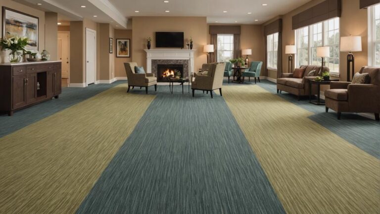
In residential areas, the choice of flooring colors can greatly influence the overall ambiance and functionality of a home. You might not realize it, but the right color contrast can enhance visibility, making spaces feel safer, especially for children and the elderly. Imagine stepping into your living room; a light-colored floor can brighten the space, while darker accents can define areas, guiding movement and reducing the risk of trips and falls.
When you consider residential aesthetics, it's crucial to think about color harmony. Combining contrasting hues—such as deep navy blue with soft cream—can create a striking yet balanced environment. It's not just about looks; these contrasts can help delineate spaces, making it easier for everyone to navigate your home. For instance, in your kitchen, a textured, light-colored floor can help prevent slips while providing a cheerful atmosphere that encourages family gatherings.
You'll find that using contrasting colors in hallways or staircases can also foster safety. A darker trim against a lighter floor can highlight steps, helping to prevent accidents. Additionally, consider the psychological effects of color; warmer tones can evoke comfort, while cooler shades may promote calmness.
Ultimately, the way you play with color in your home not only enhances its aesthetic appeal but also greatly contributes to a safer living environment. So, take the time to choose wisely; the right flooring can transform your space into a haven of safety and style.
Applications in Commercial Settings
How can the right choice of flooring color impact the atmosphere of a commercial space? The colors you select for your flooring materials can radically enhance not just aesthetics but also safety and functionality. When you choose contrasting colors, it boosts visual acuity, making spaces more navigable for everyone, especially those with visual impairments.
Consider these applications in commercial settings:
- Retail Stores: Bright, contrasting floors can guide customers through product displays, enhancing their shopping experience and reducing the likelihood of accidents.
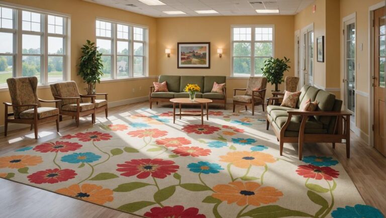
- Healthcare Facilities: In environments like hospitals, using distinct colors in flooring can help patients and staff identify different zones, such as waiting areas or treatment rooms, which is essential for maintaining safety.
- Office Spaces: Color-coded flooring can delineate work areas, break rooms, and pathways, promoting organization while minimizing distractions and hazards.
- Educational Institutions: Schools can benefit from contrasting floors as they help students navigate hallways, reducing the risk of trips and falls while fostering an engaging learning environment.
In all these applications, selecting the right flooring materials is key. They're not just about style; they play an important role in creating a space that prioritizes safety and accessibility. With thoughtful color choices, you can effectively enhance both the atmosphere and functionality of your commercial space, ensuring that everyone feels welcome and secure.
Maintenance and Durability
Maintaining the vibrancy and integrity of contrasting floors requires a proactive approach to cleaning and care. You'll want to think about your material selection carefully, as different materials have varying levels of durability and maintenance needs. For instance, vinyl or rubber floors might offer excellent weather resistance and are easier to clean, while natural stone can provide aesthetic appeal but may require more intensive upkeep.
Regular floor cleaning is essential, not just for appearance but also for safety. Dirt and debris can create slip hazards, especially on textured surfaces. Using appropriate cleaning solutions can enhance the longevity of your floors, so always follow manufacturer guidelines. Surface treatments, like sealants, can protect against stains and wear while maintaining that eye-catching contrast.
You should also be aware of longevity factors, such as foot traffic levels and environmental conditions. High-traffic areas might need more frequent cleaning and periodic resurfacing to prevent deterioration. Familiarizing yourself with effective repair techniques is important, as minor scratches or damages can quickly escalate if left unattended.
Case Studies and Examples
Exploring various case studies reveals how contrasting floors can transform spaces while addressing practical concerns like maintenance and durability. You'll find that incorporating different floor patterns not only enhances aesthetics but also provides essential visual cues that improve safety in various environments.
- Healthcare Facilities: In hospitals, contrasting floor patterns guide patients and visitors, reducing confusion. For example, using dark tiles in waiting areas and lighter tiles in corridors creates a clear path, making navigation easier for those with mobility challenges.
- Educational Institutions: Schools have adopted color-coded floors to help students and staff identify specific areas, such as classrooms and restrooms. This method not only aids in orientation but also promotes independence among younger students.
- Corporate Offices: Many modern workplaces utilize contrasting floor designs to delineate open spaces from more confined areas. The visual cues help employees recognize zones for collaboration versus those intended for focused work, enhancing productivity while minimizing distractions.
- Retail Environments: Stores often implement bold floor patterns to draw attention to promotional displays or guide customers through the shopping experience. This strategic use of color not only boosts sales but also creates a safer shopping atmosphere by clearly demarcating pathways.
In each example, contrasting floor designs serve a dual purpose: they enhance the visual appeal of a space while prioritizing safety and functionality. By choosing the right colors and patterns, you can create environments that are as practical as they are inviting.
Frequently Asked Questions
What Are the Best Color Combinations for High-Visibility Flooring?
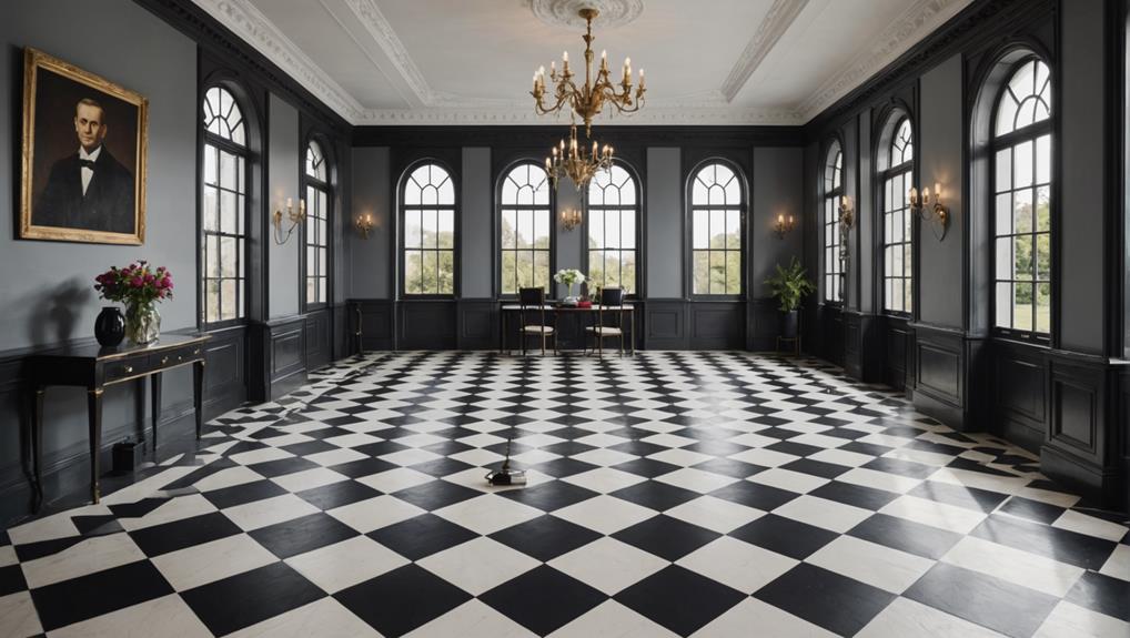
When considering the best color combinations for high-visibility flooring, you'll want to balance safety compliance with aesthetic appeal. Bright colors like yellow or orange paired with contrasting shades like black or gray can create a striking visual effect. This not only enhances visibility but also draws attention to potential hazards. Remember, a well-thought-out color scheme doesn't just keep you safe; it can also elevate the overall look of your space, making it inviting.
How Does Lighting Affect Color Contrast on Floors?
Lighting plays a vital role in how you perceive colors on floors. When the lighting intensity changes, it can drastically alter your color perception. Bright lights may enhance contrast, making colors pop and improving visibility. Conversely, dim lighting can dull hues, potentially masking safety hazards. It's important to take into account the type of lighting in your space to guarantee that floor colors effectively communicate warnings and guide safe movement throughout the environment.
Are There Specific Color Contrast Guidelines for Different Industries?
As the saying goes, "an ounce of prevention is worth a pound of cure." When it comes to color contrast guidelines, each industry has its unique standards and safety regulations. For instance, healthcare facilities prioritize high visibility to aid patient mobility, while industrial settings might focus on reducing trip hazards. By adhering to these guidelines, you not only enhance safety but also promote a more efficient and secure environment for everyone involved.
Can Color Contrasting Floors Improve Mood or Productivity?
Color contrasting floors can definitely influence mood and productivity in your workplace. Utilizing color psychology, you can create an environment that energizes or calms employees. For instance, vibrant colors might stimulate creativity, while softer tones can promote focus. In workplace design, thoughtful color choices not only enhance aesthetics but also improve safety by helping individuals navigate spaces. By selecting the right contrasts, you're fostering a more engaging and efficient atmosphere for everyone.
What Are the Costs Associated With Installing Contrasting Floors?
When considering the costs associated with installing contrasting floors, you'll want to factor in installation expenses and flooring materials. Higher-quality materials may boost safety and durability, but they can also increase your budget. You might find that choosing specific colors or patterns could influence overall costs, too. Balancing aesthetics with safety is key, so think about how much you're willing to invest in a project that enhances both visibility and your space's ambiance.